
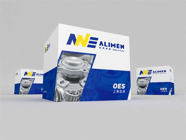
经销批发的圆锥滚子轴承、圆柱滚子轴承、深沟球轴承、离合器轴承、组合轴承、万向节、滚针轴承、主销修理包、轮毂单元轴承畅销消费者市场。
AnNeng (China) Nanjing Youpai Co., Ltd
Nanjing Youpai Bearing Co., Ltd. distributes and wholesales tapered roller bearings, cylindrical roller bearings, deep groove ball bearings, clutch bearings, combination bearings, universal joints, needle roller bearings, main repair kits, and hub unit bearings, which are popular in the consumer market.
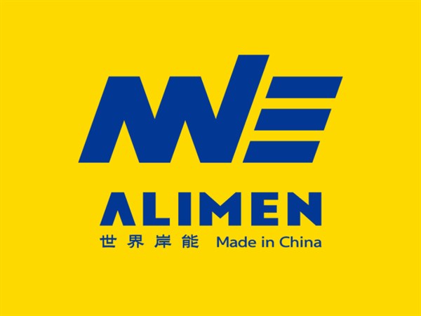
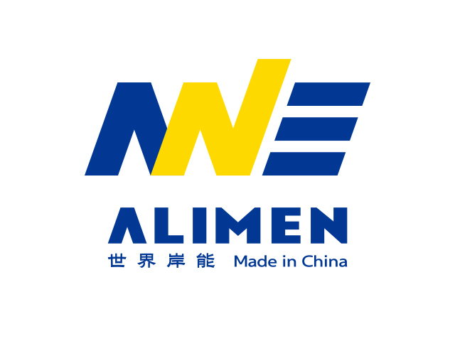
ALIMEN岸能汽车轮毂轴承品牌logo设计


ALIMEN岸能汽车轮毂轴承品牌logo设计
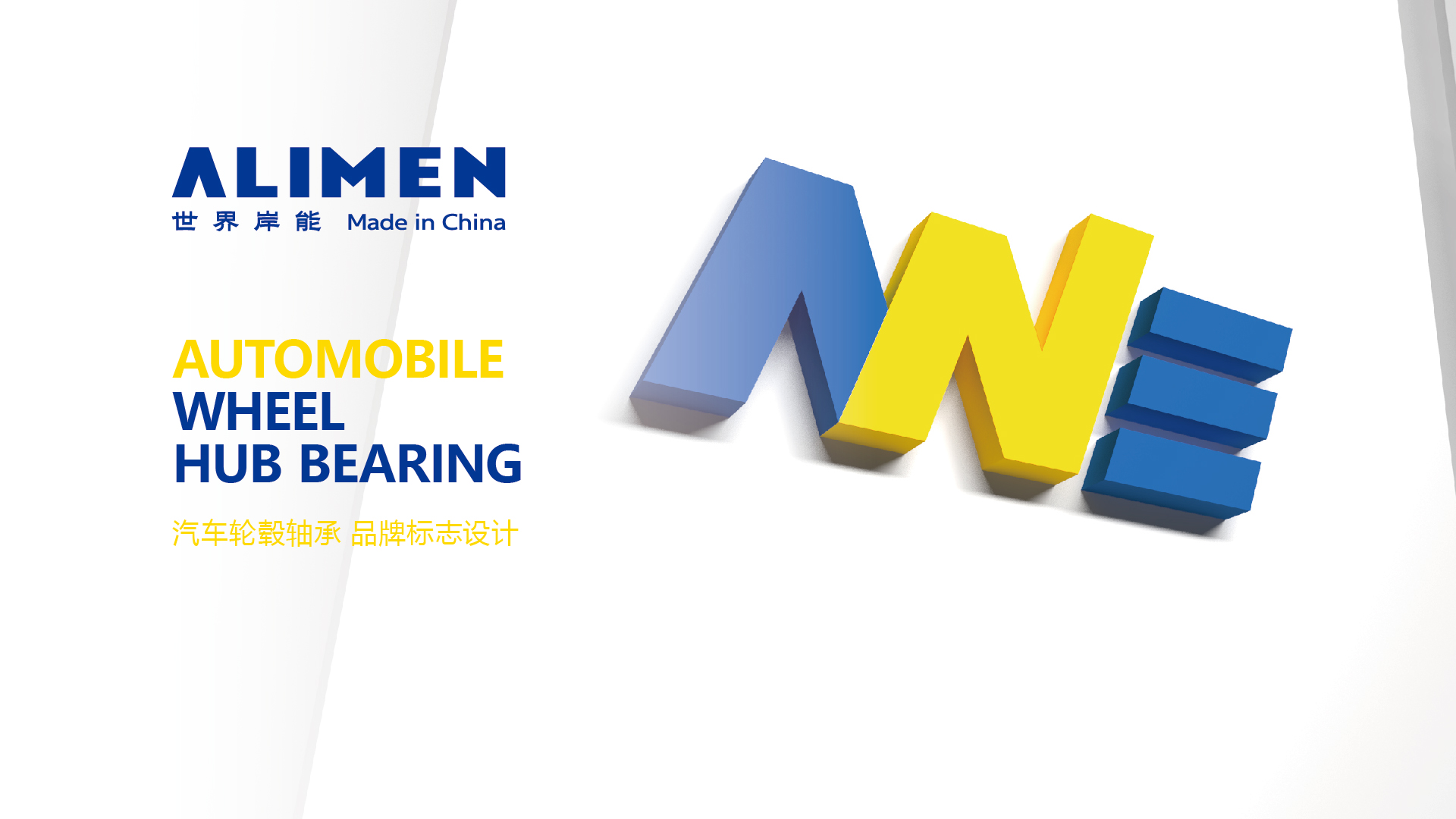
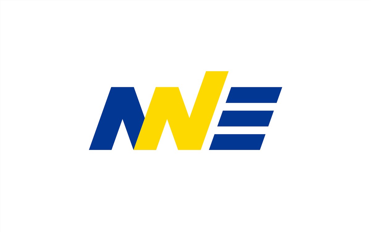
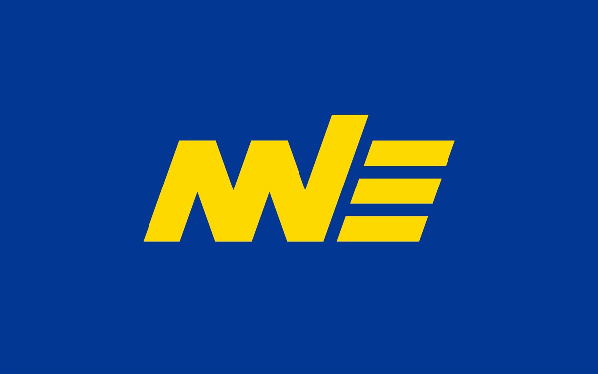
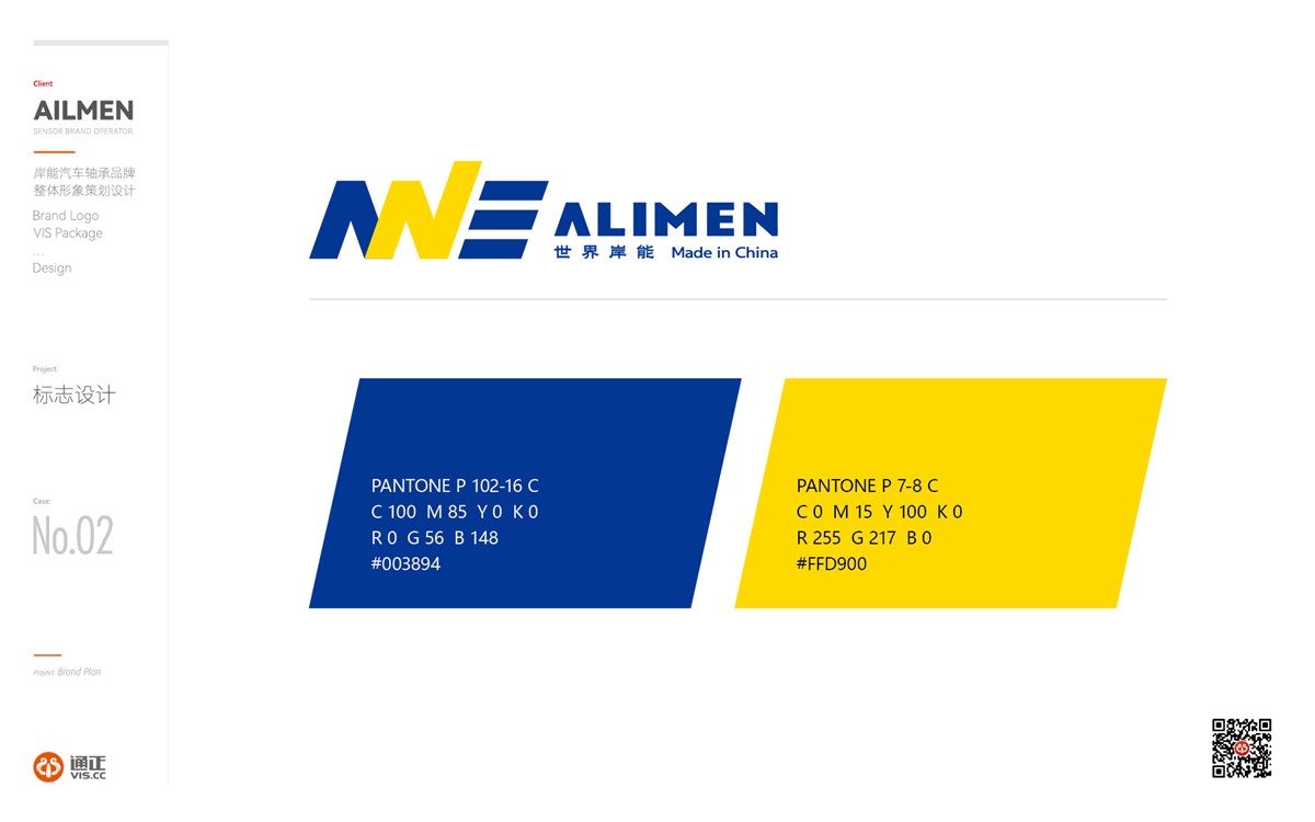
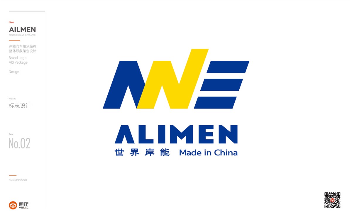
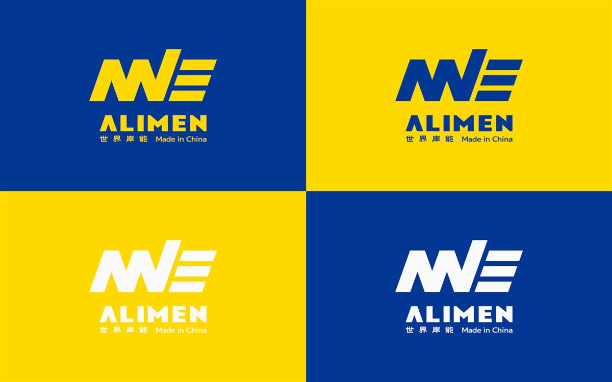
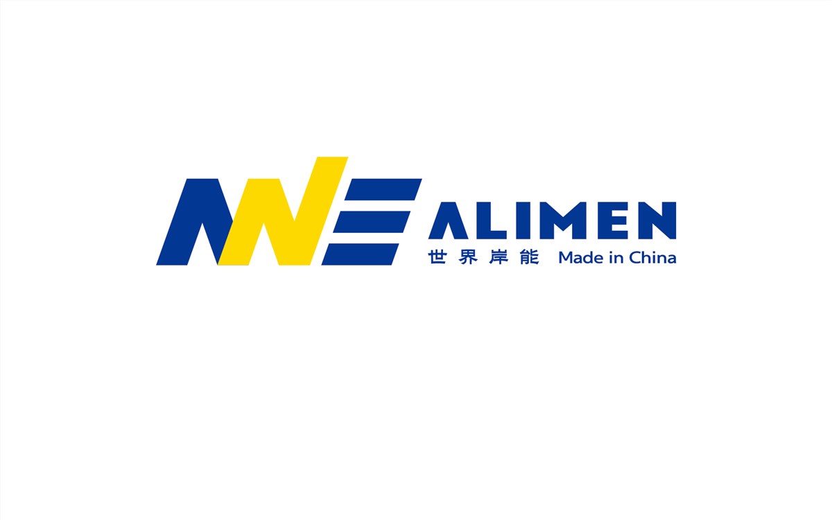
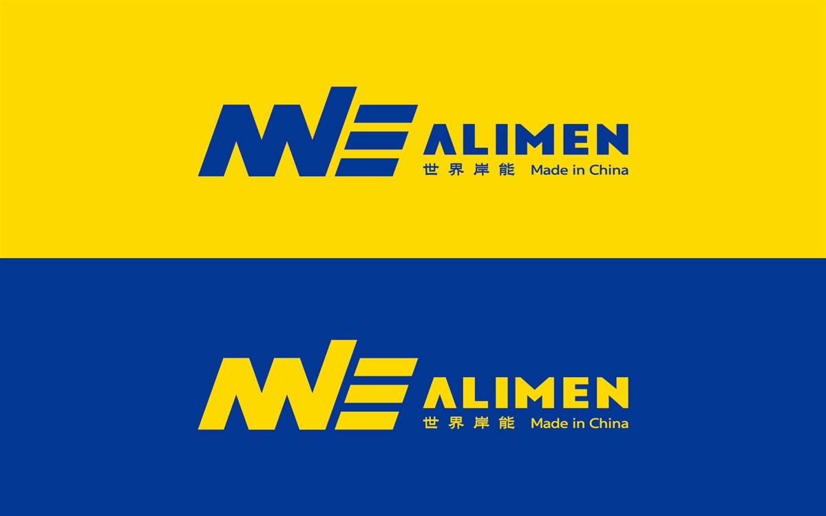
ALIMEN岸能 logo 设计说明:该 logo 以字母 “ALIMEN” 为基础进行设计。将字母巧妙变形,构建出动感的视觉效果。字母的倾斜角度和流畅线条,仿若汽车高速行驶时的速度感,寓意着产品能适应各种动态工况。
ALIMEN岸能汽车轮毂轴承品牌logo设计
图形巧妙地将字母进行变形融合,“A” 与 “L” 的部分线条化作倾斜造型,和黄色的 “N” 相互交织,右侧的 “E” 以简洁的线条呈现,整体形似汽车工业感十足,直观展现产品属性。

ALIMEN岸能汽车轮毂轴承品牌logo设计
深蓝色象征着专业、可靠和品质,体现品牌在汽车轮毂轴承领域的深厚技术积累与值得信赖的形象;柠檬黄色寓意活力、创新与高效,代表品牌积极进取、勇于突破的精神。既凸显了汽车零配件的工业质感,又形成强烈的视觉冲击。
未来,ALIMEN 品牌将秉持这些理念,不断投入研发,提升产品质量,以创新驱动发展,致力于成为汽车轮毂轴承行业的领先品牌,凭借卓越品质和创新技术走向世界,为全球客户提供优质服务。
ALIMEN Creative Design of the Logo
This logo is designed based on the letters "ALIMEN". The letters are ingeniously deformed to create a dynamic visual effect. The inclined angles and smooth lines of the letters are reminiscent of the speed when a car is driving at high speed, implying that the products can adapt to various dynamic working conditions.
ALIMEN Creative Design of the Logo
The graphic skillfully deforms and integrates the letters. Some lines of "A" and "L" are transformed into inclined shapes, intertwining with the yellow "N", and the "E" on the right is presented with simple lines. The whole logo resembles an automotive hub, exuding a strong industrial vibe and intuitively showcasing the product attributes. Dark blue symbolizes professionalism, reliability, and quality, reflecting the brand's profound technical accumulation and trustworthy image in the field of automotive hub bearings. Lemon yellow implies vitality, innovation, and efficiency, representing the brand's spirit of being proactive and daring to break through. This not only highlights the industrial texture of auto parts but also creates a strong visual impact.
In the future, the ALIMEN brand will adhere to these concepts, continuously invest in research and development, improve product quality, be driven by innovation, and strive to become a leading brand in the automotive hub bearing industry. It will go global with excellent quality and innovative technologies and provide high - quality services to customers worldwide.
推荐案例
ALIMEN岸能汽车轮毂轴承品牌logo设计
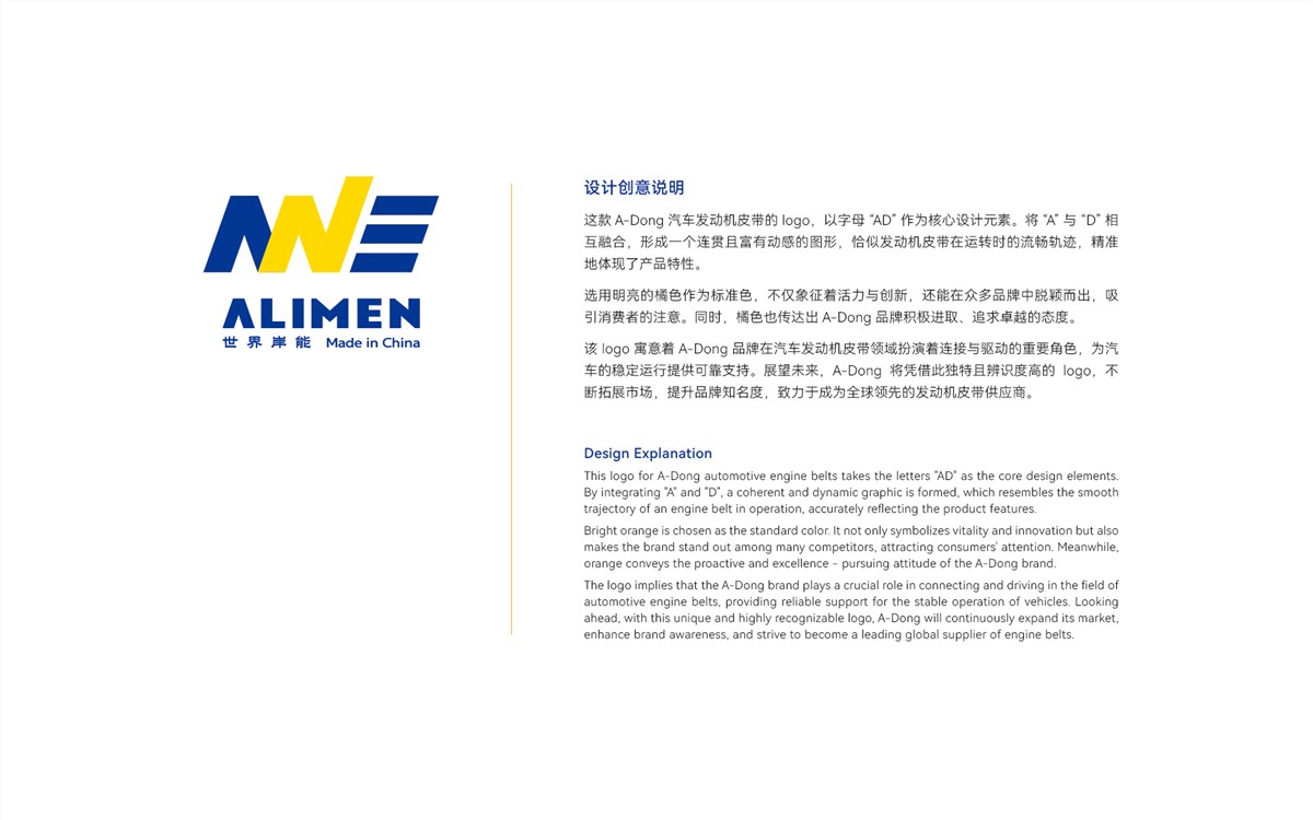
A-DONG logo汽车皮带品牌设计
